What I Learned About Website Accessibility
When I first started building websites, I’ll be honest: “accessibility” felt like a scary word. I had this constant fear of noncompliance—the worry that I’d miss a legal requirement and end up with a lawsuit or a massive headache. It felt like a giant checklist I’d never be able to finish.
But as I spent more time working on WordPress sites, my perspective shifted. I realized that while the legal side is important, accessibility is really just about making sure everyone can actually use what you build. I’ve learned that you don’t have to be a coding genius to make a difference.
Most of the improvements I’ve made were simple tweaks. I also found that using a solid foundation, like the Kadence Theme, took a lot of that “legal” weight off my shoulders because it handles so many of the technical standards right out of the box
1. Headings Are Like an Outline
I used to just pick heading sizes based on how “cool” the font looked. Big mistake! I learned that headings (H1, H2, H3) are actually a map for the page.
- H1 is your title
- H2s are your main chapters
- H3 are subpoints
For example, a website care page might look like this:
- H1 – Website Care Plans
- H2 – What Website Care Means
- H2 – What’s Included
- H2 – Website Care Packages
- H3 – Basic Care
- H3 – Standard Care
This structure makes the page easier to navigate for people using assistive technologies.
2. Don’t Ignore the “Alt Text” Box
I used to leave the “Alt Text” field blank when uploading images because I was in a hurry. Now I know that’s how screen readers describe an image to someone who can’t see it.
Instead of a file name like IMG_567.jpg, I now take five seconds to write “A laptop sitting on a wooden desk.” It’s a tiny habit that makes a huge impact.
3. Contrast Is Your Best Friend
Text should be easy to read against its background. Low contrast text (like light gray on white) can be difficult for many users to read.
That’s why I love a clean aesthetic, but I learned the hard way that light gray text on a white background is a nightmare to read. If people have to squint to see your content, they’re just going to leave. I now stick to dark text on light backgrounds (or vice versa) to make sure everything pops.
A good rule of thumb is:
- dark text on light background
- strong contrast between text and background
Themes like Kadence make it easy to adjust global color settings so your entire site remains readable.
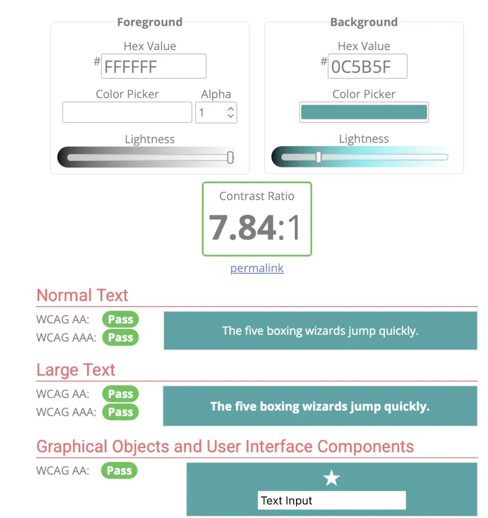
What I learned from this tool: As you can see in this test for my site, a contrast ratio of 7.84:1 is excellent. It passes both WCAG AA and AAA standards for normal text, large text, and even user interface components like icons and buttons.
Using a tool like this takes the guesswork out of design. It ensures that whether someone is viewing your site on a bright sunny day or has a visual impairment, your content remains crystal clear.
4. Use Descriptive Links. “Click Here” Is Pretty Useless
I realized that if someone is skimming a page or using assistive tools, a link that just says “Click Here” doesn’t tell them anything. It’s much more helpful to write “Check out our website care plans.” It tells the user exactly where they’re going before they even click.
Or instead of writing: “Click here” >>Use something like: “Learn more about our website care plans.” Descriptive links help both visitors and screen readers understand the purpose of the link.
5. Put Down the Mouse, Test Keyboard Navigation
This was the most eye-opening lesson for me: try navigating your site using only the Tab key on your keyboard. Some people can’t use a mouse at all. If you can’t get through your menu or click a button using just your keyboard, your site is essentially “locked” to those users.
I was surprised to learn that different browsers actually handle these “shortcuts” differently. If your theme isn’t built correctly, a user might get stuck or lost. Here’s a quick breakdown of how common browsers handle keyboard navigation:
|
Browser |
Link Navigation |
Form Controls |
Header / Menu Nav |
Misc (Images/Styles) |
|---|---|---|---|---|
|
Google Chrome |
TAB, Shift-TAB, Shift-Return |
TAB, Shift-TAB |
None |
None |
|
Internet Explorer |
TAB, Shift-TAB |
TAB, Shift-TAB |
None |
None |
|
Mozilla Firefox |
TAB, Shift-TAB |
TAB, Shift-TAB |
None |
None |
|
Firefox + Extension |
A and Q |
TAB, Shift-TAB |
W/S (Headers), E/D(Menus) |
None |
|
Opera |
Opt-TAB, Opt-Shift-TAB |
TAB, Shift-TAB |
None |
None |
This is why I rely on a theme like Kadence. Since most browsers don’t have “built-in” ways to jump to headers or menus with a single key, the theme has to be coded perfectly so the Tab key follows a logical path. Without that, you’re looking at a major noncompliance headache
Why the Right WordPress Theme Matters
Accessibility improvements are easier when your website starts with a solid foundation.
That’s one reason I often recommend the Kadence Theme. It is designed with performance, usability, and accessibility in mind, which makes it easier to build clean and well-structured WordPress websites.
If you’re building a new WordPress website or upgrading an existing one, using a theme that follows accessibility best practices can save a lot of time. You can learn more about the theme here:
In Conclusion
Accessibility doesn’t require a complete website redesign. Small improvements — like better headings, readable text, and proper image descriptions — can make a website easier for everyone to use.
When these practices are combined with a well-built WordPress theme like Kadence, creating accessible websites becomes much more manageable.